Overview
The transportation service in Indiana University - JagLine Mobile App Redesign
JagLine shuttle service is a free transportation service at Indiana University. Although it aims to be an environmentally friendly and convenient transportation method for the students and staff, many people are unhappy with the service. For this class project, my team and I were tasked with improving the overall usability and visual design of the JagLine mobile app. Within five weeks, we researched, ideated, prototyped, and tested our way to a design proposal target to offer a smooth experience for Jagline users.
Project type
Mobile app redesign
Teamwork with 2 UXR
Duration
3 months
Tools
Figma, Excel, Miro, Vimeo
My role
Product Designer
UX Researcher
Why a redesign?
"Searching for bus routes and navigation in JagLine is a pain!"

The primary function of JagLine is to search for bus routes to on-campus destinations and to navigate. However, the complex workflow and lack of clear visual cues result in increased cognitive load for users, especially for new students who are unfamiliar with the on-campus environment. When our team was researching and trying to find the route from the place we were to the campus center, two of us failed until the experienced one guided us to finish the task in person.
Redesign version:

Research
User Interviews
Through interviews, we can gain direct insights into what users think about Jagline, what they are confused about, and the challenges they may face while using the app especially for the first few times. We interviewed four IUPUI students. All of them had experience using the JagLine service.

Interview key takeaways
01
Low-efficiency workflow
When users went to the app to search for possible routes to their destinations, the complex workflow made it challenging to understand how it works, which might result in increased cognitive burden for users and a high uninstall rate.
02
Outdated app interfaces
The current JagLine app interfaces are outdated and lack a clear, informational hierarchy and visual cues, making the app is difficult-to-use.
03
Lack of necessary guidance
The current JagLine app lacks guidance for common cases, such as new students taking the bus for the first time or people forgetting to take their student ID.
System Usability Scale evaluation
After the interviews, we created a System Usability Scale (SUS) questionnaire to help us evaluate the system's usability and understand how users perceive and interact with JagLine. According to the System Usability Scale (SUS) evaluation, the overall SUS score of JagLine is 53.44, which is lower than the average system scale score. This indicates that the usability of the JagLine is perceived as less user-friendly, and the redesign is fitted.

Design
Design Principles
People want "the most intuitive design."
Thinking through what users would need during the use cases identified, we determined the design requirements for the solution. We did so to ensure we held ourselves accountable for referring back to the data learned in research and to use these requirements as our guiding principles as we brainstormed.

Prototyping and Testing
After deciding on the final wireframe version, we conducted usability testing to understand users' needs better and to validate our low-fidelity prototype's usability. We had three participants walk through the app, asking for their opinion on their experiences along the way. Through this, we uncovered some new iteration opportunities.

User Testing Insights
01
More detailed on the route page
Even though we have marked the bus colors on each route, people still want to include more details, like, the bus names, because the JagLine buses on the campus look the same from the appearance, so they have to check the bus name from the bus's flashing running lights to ensure they take the right line.
02
No need for a bus schedules page anymore
Since we have offered real-time transit info and bus route options, users expressed no longer need the bus schedules page.
03
Word completion and suggestion feature required
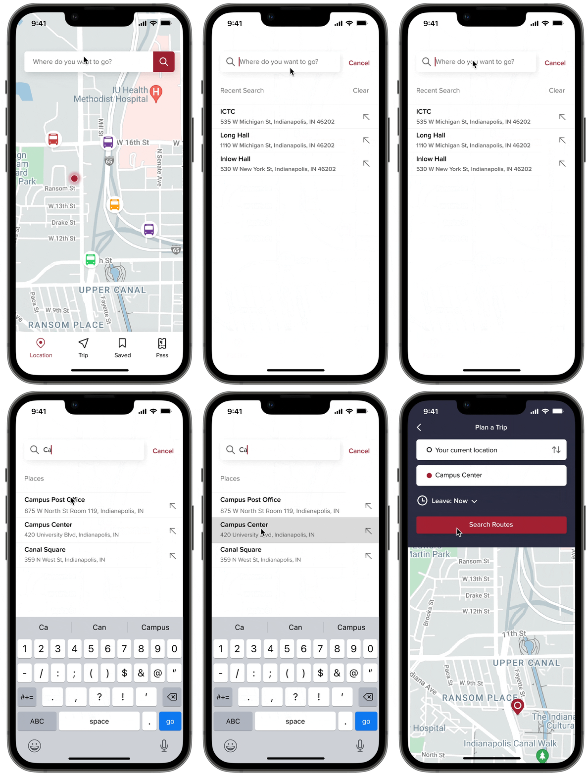
Most of the new students cannot spell the full name of the places in campus correctly, users wanted an Word completion and suggestion feature in the search bar which might decrease their spelling load.
Visual language
When considering how best to create an enjoyable JagLine experience, we made sure to explore a variety of different colors and fonts in the redesign. Ultimately, we chose the classic JagLine red color against an understated navy blue and a rounded sans-serif font for the typography.

Final Solution

Logical search for the destination
Utilizing word completion and suggestion features for destination search, combined with real-time positioning, facilitates swift and effective route exploration, ensuring a quick and efficient searching experience.
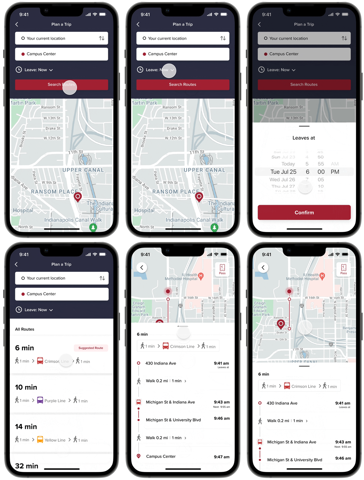
Detailed route options and navigation plan
Providing real-time info and detailed route plans according to users' position and availability empowers users to decide whether to get on JagLine, which line fits them, and how to get there.


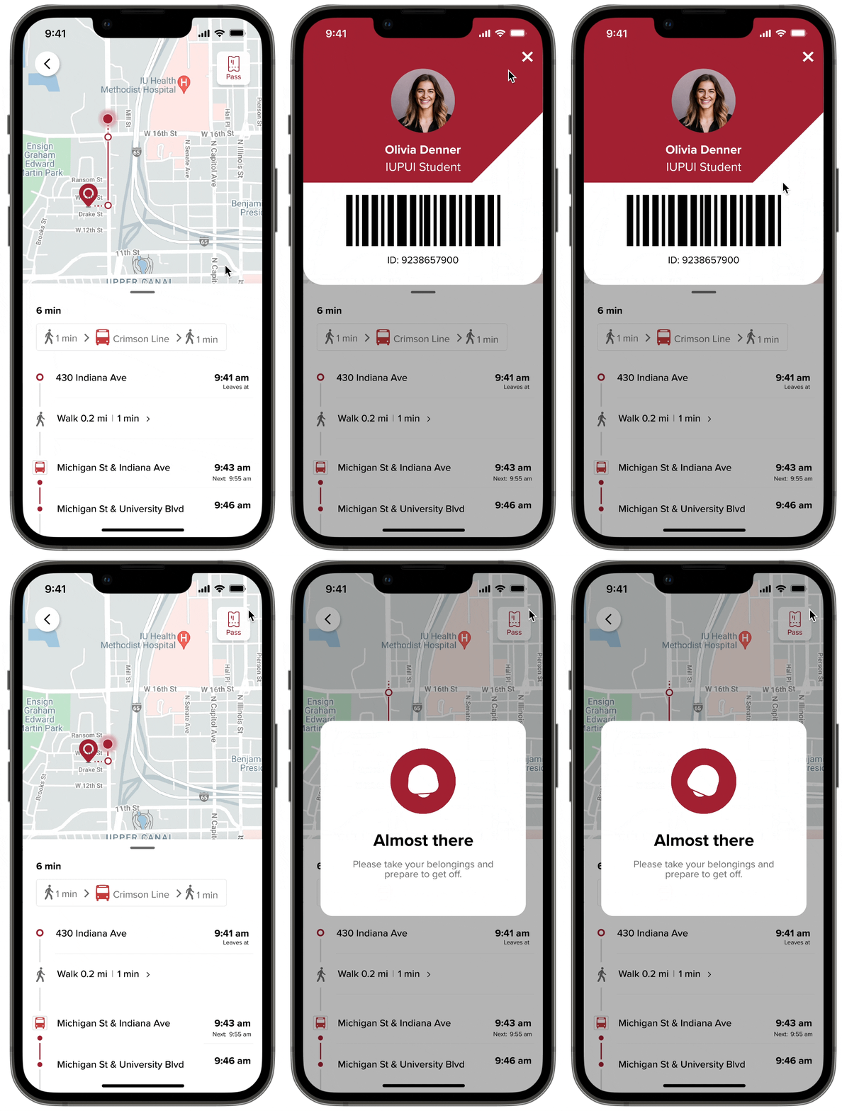
Never miss a bus again
The in-app student card and real-time notifications for getting off enhance the overall experience by providing students with valuable guidance, ensuring a smoother journey.
Reflection
01
Always keep the user’s needs as the center of the design
02
Keep close collaboration & communication with teammates
03
Always think about how to make a human-centered design instead of a technology-friendly design
If we had more time, we would like to consider emerging VR technology to the JagLine app to help students navigate the route. Also, Unity 3D can be used to show the buildings clearly on the map so that the search process can be much more labor-saving for students.


